
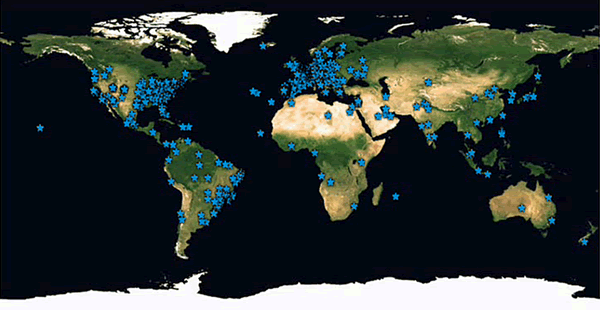
Click image to visit the map | Cliquem na imagem para ver o mapa
|
Last Friday Portugal was going through one of the coldest days in the last decades: there were temperatures below zero and snow, conditions rather unusual for our mild winters. So i decided early in the morning to do something that would keep me busy and warm throughout the day: a map built by users, using their pictures showing the weather in their cities. The first call for collaboration was sent via Twitter. Many of the tweople i follow were already discussing the issue, and all i had to do was to ask for their photographs and videos. They just had to look out the window, use a camera or cellphone and post them on Twitpic, Flickr or Picasa. A few took the challenge early on, and there was a small frenzy about the map i just had setup. When the first contributions arrived someone let me know that some online newspapers were asking for pictures too. No maps though. The map i created was open to anyone to add their own pictures and locations, and i “templated” it with the first pictures. The word spread out mostly by retweeting. By lunch hour i had a few contributions, not as many as the news websites of course, but some visually compelling. The public news channel – that has a very effective Twitter participation – picked up the idea and on their web segment at night news talked about the map. At the end of the day i had a cool 1,000 visitors. I decided to use that publicity to take the experiment into the weekend, and see how it would work. The good stuff The first impression i got was that there was a will to participate and share with others the personal experience on the weather. There were a lot of contributions on the news websites and blogs that also requested pictures of the cold wave, so there was a lot of material to work with. The idea caught on pretty easily too among my Twitter contacts, which helped to drive traffic to the map and get links to pics and slideshows. There was some quality stuff there. Functionally, the map was quickly set up, and there were no major technical issues, although i was asked to place the pictures quite often, instead of being the users posting them themselves. The number of visits was also surprising: in three days of useful life it had over 2,500 visitors. And it got my name on television. The not so good stuff Despite noticing some initial interest on the project, it faded away rather quickly. It was a stand alone feature, and not associated to any other type of narrative content. It might have worked better as a mashup with weather info and readers comments, or local news rss feeds about the weather, twitter hashtags, etc. I also had all the work, i expected more independence from the users when it came to place the pics on the map, but i had no tutorial explaining how to do it anyway. So maybe i expected too much. The contributions came not only as pictures but also as links to blogs who had some, and i asked bloggers to share their own crowdsourcing efforts. I took too much time to define a domain name to the map, i had a tip from a fellow tweeter to use a free domain (mapadofrio.pt.vu). Easier to remember, easier to use. Conclusions For a project like this to work it shouldn’t be used as a stand-alone, but integrated in a streaming narrative, open to collaboration, and easier to interact. There was a real interest on the user side to participate, so the power of the crowd is still strong. I could have used more publicity, or have access to a wider audience, even with a reference on TV. But it was easy, fast and cheap to set up. And as far as i can tell it was unique here in Portugal. There were a lot of requests for pictures, but no maps. Originality wins extra points. To finish this short analisys i’d just like to thank all the people who participated and spread the word. More and more the creation of web contents depends on the users input. And a question: what else could have been done?
|
Sexta-feira passada Portugal estava a meio de uma das maiores vagas de frio das últimas décadas: temperaturas abaixo de zero e neve, condições raras nos nossos Invernos amenos. Por isso decidi logo de manhãzinha fazer algo que me mantivesse quente e ocupado ao longo do dia: um mapa feito por utilizadores, que mostrasse fotos do frio nas suas localidades. O primeiro apelo à participação foi feito via Twitter. Muita da tweople que sigo já discutiam o assunto, e tudo o que precisei de fazer foi pedir pelas suas fotos e vídeos. Bastava-lhes olhar pela janela, usar uma máquina fotográfica ou um telemóvel e postar as fotos no Twitpic, Flickr ou Picasa. Alguns aceitaram logo o desafio, e houve alguma agitação à volta do mapa que tinha criado. Quando as primeiras contribuições chegaram houve alguém que me disse que alguns sites informativos também andavam a pedir fotos. Mas nada de mapas. O mapa que criei estava aberto a toda a gente que quisesse adicionar as suas fotos e locais, e formatei o conceito nas primeiras fotos. A palavra espalhou-se principalmente através de retweets. À hora de almoço tinha algumas participações, não tantas como nos sites de informação claro, mas algumas visualmente interessantes. A RTPN – que usa muito bem o Twitter – pegou na ideia e falou do mapa no segmento web do À Noite As Notícias. No final do dia tinha uns 1,000 visitantes. Decidi aproveitar a deixa e prolonguei a experiência pelo fim de semana, para ver no que dava. A parte boa A primeira impressão com que fiquei foi que existia uma vontade de participar e partilhar com outros a experiência pessoal desse dia. Houve muitas contribuições nos sites informativos e blogs que pediram imagens da vaga de frio, por isso havia muita matéria prima com que trabalhar. A ideia pegou facilmente entre os meus contactos no Twitter, que ajudaram a gerar táfego para o mapa e obter links para fotos e slideshows. E havia coisas com qualidade. Funcionalmente, o mapa foi fácil de montar, e não houve grandes problemas técnicos, embora me pedissem para pôr as fotos, em vez de serem os utilizadores a colocá-las por eles mesmos. O número de visitantes também foi surpreendente: em três dias de vida útil o mapa teve mais de 2,500 visitantes. E apareci na TV. A parte menos boa Apesar de reparar num entusiamo inicial à volta do projecto, ele esmoreceu rapidamente. Era uma criação isolada, não associada a qualquer outro tipo de narrativa. Poderia ter funcionado melhor como mashup com informação meteorológica, comentários, feeds rss locais, hashtags do Twitter, etc. Também tive que fazer grande parte do trabalho, esperava que os utilizadores pusessem as fotos no mapa, mas também não tinha nenhuma explicação sobre como fazê-lo. Talvez as expectativas fossem altas demais. As contribuições não foram só fotos mas também links para blogs que tinham outras imagens, e ainda pedi algumas a mais uns bloggers. Demorei demasiado tempo a criar um domínio para o mapa, mas tive uma dica pelo Twitter para usar um gratuito (mapadofrio.pt.vu), mais fácil de lembrar e usar. Conclusões Para um projecto destes resultar não pode funcionar de forma isolada mas integrado numa narrativa contínua, aberto à colaboração e terá que ser mais fácil de interagir. Houve um interesse real por parte dos utilizadores em participar, por isso o poder da multidão é forte. Podia ter tido uma maior divulgação, mesmo com a menção na TV. Mas foi fácil, rápido e barato de montar. E até onde pude ver foi algo de único. Muitos sites pediram fotos e a colaboração dos utilizadores mas nada de mapas. A originalidade ganha pontos extra. Para terminar esta curta análise, só queria agradecer a todas as pessoas que participaram e passaram a palavra. Cada vez mais a criação de conteúdos web depende da contribuição dos utilizadores. E uma pergunta: que mais poderia ter sido feito? |


Comentários Recentes